How to Create an Effective CTA (Call to Action)
Boost your click-through rates and sales with these call to action tips, from button color, size, and shape to A/B testing the copy that converts best.


What exactly is a call to action?
A call to action is a message designed to prompt users to act. CTAs are short, simple phrases built to move users toward an action quickly. They appear as buttons in visuals or as text within content, and they usually point to a link or a form. Phrases such as Buy Now and Shop Today are classic examples of calls to action. Landing pages, emails, banners, forms, and social media posts are where they are used most.
A call to action is essentially a free win. By using calls to action you can steer customers and readers toward your goal faster, capture their interest, and increase both your click-through rates and your sales.
The most effective call to action examples
Who would not want to sell more of a product, and who would not want more traffic? The calls to action below are the messages users respond to most; pick the ones that fit and use them on your site or in your posts to get better results.

Sign Up Now
Buy Now
Apply Today
Grab the Deal
Join the Campaign
Try It Free
Order Now
Start Using It Today
Same-Day Shipping
Contact Us
Limited Stock
Act Fast
Learn More
A/B testing your calls to action
How do you discover the call to action that will perform best for you? You will need to change a few variables and observe how clicks shift after each change. Even changing the size or color of a call to action button will move your click-through rates. Change and add the variables below one at a time, identify the format that wins the A/B test, and move forward with it.

- The copy on the button
- Its color
- Its size
- Its shape
- Its placement on the page
- Its contrast with the background
- Whether it includes a special discount
- Whether it includes a campaign end date
- Whether it states that it targets a specific group
We recommend running your A/B tests as a continuous improvement loop. Over time you will see how many more clicks you earn compared to where you started.
Call to action tips
Based on data from a study conducted with 100 people in Europe, let's look at how to build an effective call to action:
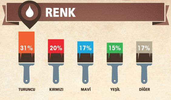
Color:
Choose vivid colors for your calls to action. As the data above shows, users clicked the orange button most. When picking a color, do not lose sight of your website's overall design.
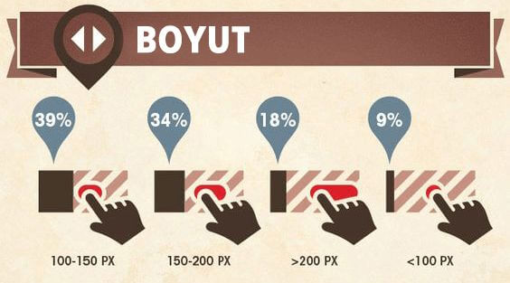
Size:
CTAs should be neither too large nor too small. A CTA size of around 100 to 150 px works well.
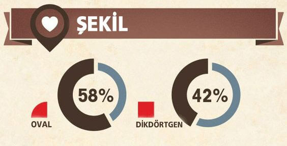
Shape:
Designing your CTA buttons with rounded rather than rectangular shapes can earn you more clicks.
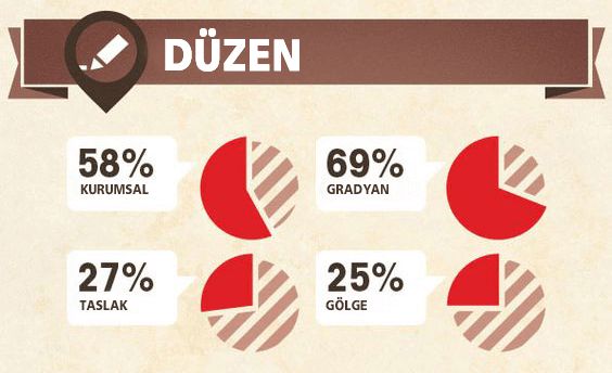
Style:
Using gradients in calls to action raises click-through rates. You can lift your own CTR by applying a gradient to your CTA buttons.
According to this data, the best practice is an orange, 100 to 150 px, gradient CTA button. That is not a universal standard, of course; you should keep running A/B tests suited to your site and your goal to find what works best for you.

Let us make your brand visible in AI search.
Share your goals, we'll come back with a custom growth plan within one business day. A strategy lead will reach out personally.
Get in touch